Promotional Banner System
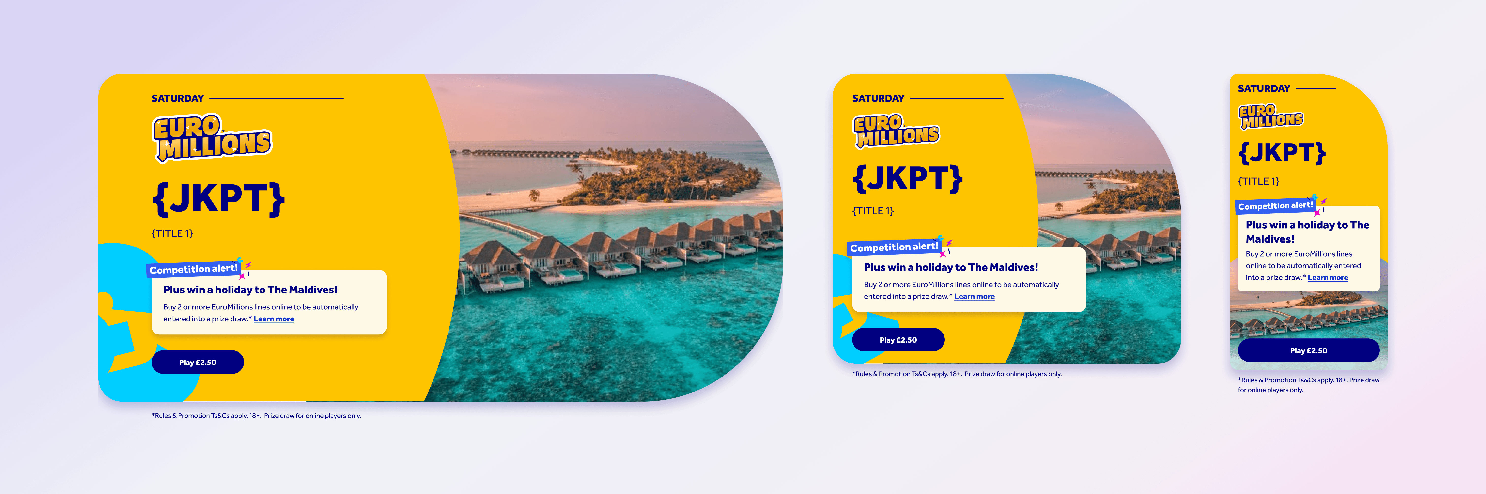
This project delivered a promotional banner system for National Lottery events and prize draws, spanning web and app. Each banner pulls in dynamic content — title, jackpot value, prize copy and countdown — via CMS, and adapts across breakpoints while staying true to each game's own brand identity, from EuroMillions to Lotto.
My role: Research, Information architecture, user flow architecture, UX/UI design, prototyping, user testing


The web homepage at the time.
The web homepage at the time.
The Problem
The Problem
Web had a dedicated promo slot on its homepage. The app had no homepage at all, so there was no equivalent space — event branding and awareness had nowhere to live except inside the gameplay screen itself, and even then, it wasn't consistently carried through.
Web had a dedicated promo slot on its homepage. The app had no homepage at all, so there was no equivalent space — event branding and awareness had nowhere to live except inside the gameplay screen itself, and even then, it wasn't consistently carried through.
The Solution
The Solution
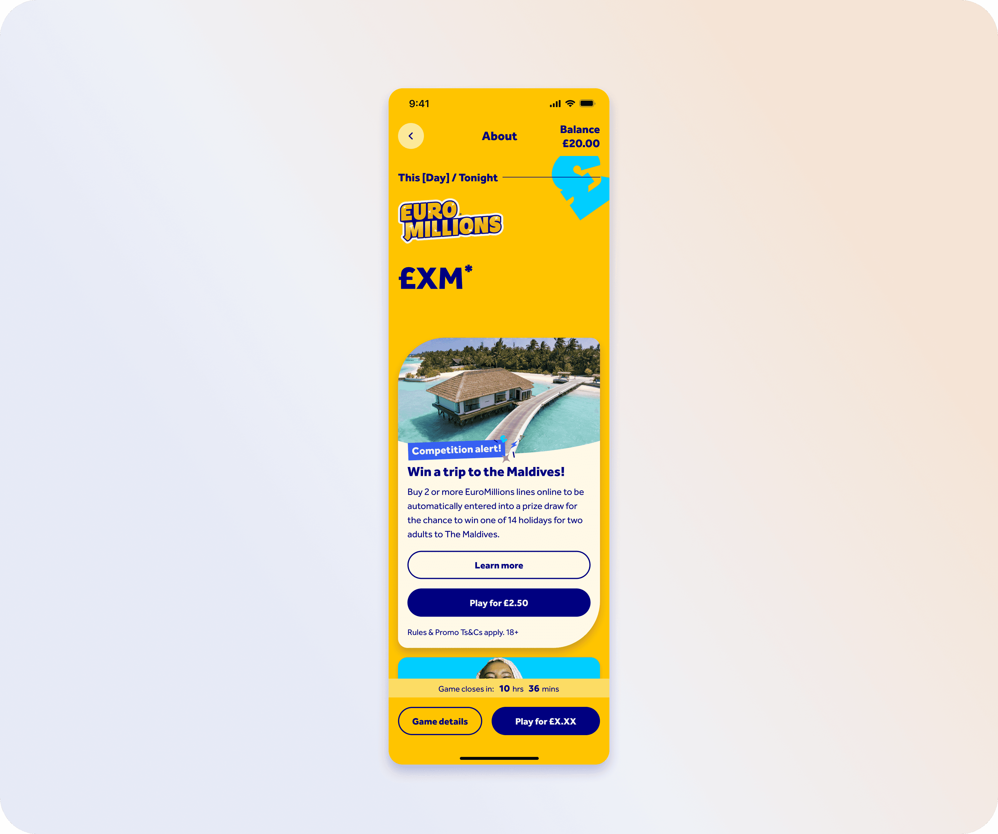
Rather than designing a bespoke component per event, we built one flexible promotion system — combining previously separate promo slots into a single, larger unit, with micro-transitions and parallax to bring it to life. The system was built to adapt: showing different amounts of real estate depending on a promotion's priority, rather than cramming every message in at once, and carrying that same branding and awareness through the play journey itself, not just the homepage.
Rather than designing a bespoke component per event, we built one flexible promotion system — combining previously separate promo slots into a single, larger unit, with micro-transitions and parallax to bring it to life. The system was built to adapt: showing different amounts of real estate depending on a promotion's priority, rather than cramming every message in at once, and carrying that same branding and awareness through the play journey itself, not just the homepage.

The Research
The Research
We tested the event advert and gameplay prompts with real players to see whether they captured attention, conveyed the right information, and built awareness of ongoing promotions like the Millionaire Maker raffle. Most participants noticed and understood the event advert as part of their normal EuroMillions journey — only one went through the full flow without registering that they'd entered a competition.
Testing three advert variations showed players wanted the game itself — not the competition — to lead: a clear, prize-focused subtitle (like "Win a holiday to the Maldives") outperformed heavier competition-style messaging, which some players found overly salesy. Carrying the same visual style from the home screen through into gameplay prompts helped catch the attention of players who'd missed the promotion earlier, reinforcing awareness at the moment they were actually playing.
This shaped a few key decisions:
Lead with the game tile, not the competition framing
Use impactful, prize-focused subtitles rather than generic "competition alert" language
Carry gameplay prompts through consistently to catch players who miss the homepage promo
Review copy clarity where players could confuse one promotion with another
We tested the event advert and gameplay prompts with real players to see whether they captured attention, conveyed the right information, and built awareness of ongoing promotions like the Millionaire Maker raffle. Most participants noticed and understood the event advert as part of their normal EuroMillions journey — only one went through the full flow without registering that they'd entered a competition.
Testing three advert variations showed players wanted the game itself — not the competition — to lead: a clear, prize-focused subtitle (like "Win a holiday to the Maldives") outperformed heavier competition-style messaging, which some players found overly salesy. Carrying the same visual style from the home screen through into gameplay prompts helped catch the attention of players who'd missed the promotion earlier, reinforcing awareness at the moment they were actually playing.
This shaped a few key decisions:
Lead with the game tile, not the competition framing
Use impactful, prize-focused subtitles rather than generic "competition alert" language
Carry gameplay prompts through consistently to catch players who miss the homepage promo
Review copy clarity where players could confuse one promotion with another
The Outcome
The Outcome
The result was a single promotional system, stress-tested across multiple real scenarios, that extended event awareness beyond the homepage CMS slot into the moments players were actually playing — closing the gap the original brief identified, without needing a bespoke design for every event.
The result was a single promotional system, stress-tested across multiple real scenarios, that extended event awareness beyond the homepage CMS slot into the moments players were actually playing — closing the gap the original brief identified, without needing a bespoke design for every event.

Get in Touch
Reach out by phone or email — I'd love to hear from you.
Or email huwmandesign@gmail.com
Get in Touch
Reach out by phone or email — I'd love to hear from you.
Or email huwmandesign@gmail.com
Get in Touch
Reach out by phone or email — I'd love to hear from you.
Or email huwmandesign@gmail.com